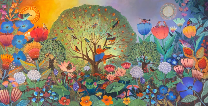
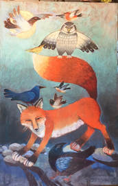
 2023 was an amazing year and one word kept popping into my mind as we went from one event, one celebration, one project to the next, and that word was abundance. The year included a trip to Italy, an art show in Anchorage, reunions with old friends, a backpacking trip in the Trinity Mountains with part of the family, cabin time with more family, an art show with my husband, a wonderful painter, at Highland Art Center in Weaverville, and an artistic highlight and challenge to create art for a 10x20 foot mural at Gold Ridge Organic Farms.
We are fortunate to live in Sonoma Valley, a temperate region of farms, wineries, orchards with hiking trails all around the hills. So when I was asked to come up with an idea for the mural, I realized it should be about this abundant time in our life as well as the area we live in. This piece will be reproduced and installed on the wall in the tasting room at Gold Ridge, and the original is going to a wonderful collector's home next month. As part of my series, Woman and Fox, A Journey, it gave me a chance to explore the abundance of our world and of my life at this particular stage, but also to spend many days with the knowledge that my life is good. And sometimes that is hard to admit. I am working on that, on not qualifying how good life is at this moment with reasons it is not perfect, or with apologies about my own imperfections or not doing enough to solve the world's problems. Woman and Fox are at peace in the 'tree of life' with all they have been given. At the end of last year and as this new year begins, I want to maintain that gratitude, awareness and contentment knowing that it will be a thought others can share. Here is to a broader picture of 2024, to thoughts and images we can carry in our mind to lift our spirits and those of others. Happy New Year.
1 Comment
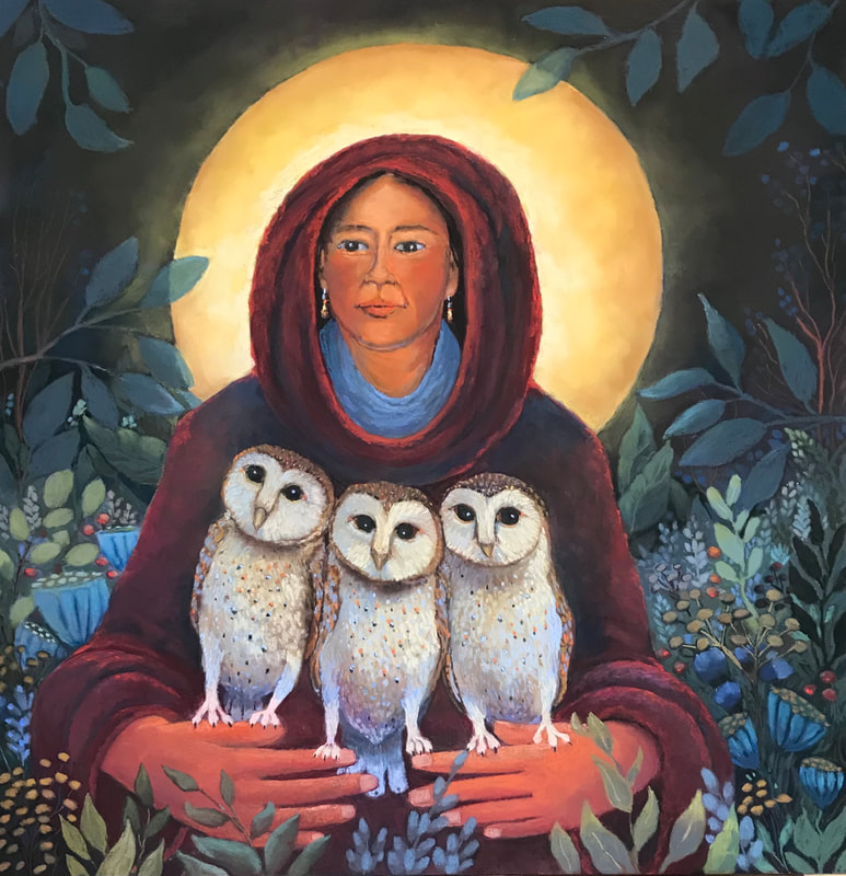 I let this sit in my studio with me for a long time before placing it in a gallery. I needed the message I wrote for myself. I needed new wisdom, not the same mindset I kept going back to. I don’t know about you, but my insights often come in the night through dreams. I don’t always know what the dream is about, but I think my mind at rest makes new sense out of the world and gives me new wisdom for my own journey.
The owls in the image above called BRINGING NEW WISDOM are young, still curious, still observing. I listen to the young people in our family looking at the world in a different, often more creative manner, without the old fears and prejudices that our older generation can unknowingly carry. They have new ideas, fresh insights that they gift to us. They still come from a garden of dreams. This painting is my hope that while we add our wisdom of years we always stay open to new wisdom and that it arrives in a beautiful manner. 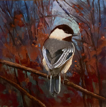 I don't know about others but it is so easy for me to get caught up in continuing a series of work, achieving a goal, admittedly vague sometimes, that I forget to take a break and do the easy. Spring started early in Northern California this year and I was working on the eighth and ninth paintings in a series you can find on my website called Woman and Fox, A Journey. Then we were presented with unseasonably warm weather and birds acting like it was spring. Birds are the comfort food for my soul. So I did what any bird loving painter would do. I put aside my larger, more serious work and took a break to enjoy walks and hikes and the backyard and birds. No matter where you take a walk you see chickadees, nuthatches, titmouses, stellar jays, sparrows, wrens, towhees, robins, and just this week, bluebirds. The other thing you see is the wonderful light of late winter skies filtering through bushes and trees forming a stained glass tabernacle around these birds. I think in a way I worship birds because they manage to sing no matter what is happening in the world. I have been doing 12x12 paintings with pastel and alcohol solvent. AFTER THE EVENING SONG and Winter Tabernacle are two of the pieces you can find on my website. 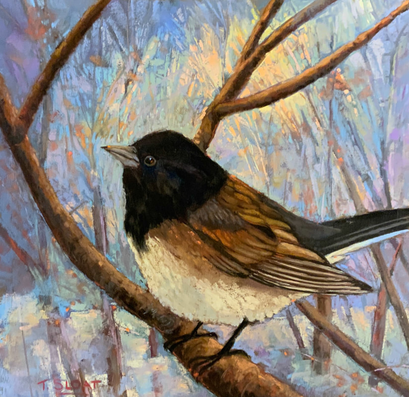 I am not satiated yet. There are more to come.
I am curious about those of you reading this...what form does soul food come in for you?
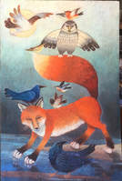
I often find myself creating elements of a story out of order. This used to happen when I did more book writing and illustration as well. I could see part of the story, but didn't quite know where it would fit in the overall plot or thought. The series of Woman and Fox are not done in order but are starting to feel like a journey of the mind as it follows the soul or our true self. The image on the left is called PATIENTLY WAITING and actually feels that it comes before REMEMBERING THE NAMES OF CLOUDS which was done earlier. The fox in patiently waiting circled many times finding the right place to wait for me as it is hard for me to stay on a path, stay together with the inner part of me. I get busy with sometimes inconsequential activities that fill time, that feed the ego. I get distracted from my own path with curiousity about someone else's path. When I paint the fox in my pictures I always feel a sense of coming home, a sense that even if I dawdle, that deeper part of me will always be there waiting to continue the journey with.
I am a strong advocate of finding out who we are as individuals. I have to admit I feel a strong connection to the idea, but perhaps not the realities, of the nomadic life. I am a lucky traveler as I have a wonderful, supportive husband, who is an artist and craftsman, a family of healthy amazing children and grandchildren, and a community of friends, all of whom I can share journeys with. But I can still feel a little afloat unless I get back on my own personal journey, my need to travel alone in in the landscape of my mind as well as in the natural world. It is a journey to match my outside ego-driven life to the what my inside believes. I think we are all familiar with that journey even if we do not choose to paint it or talk about it. I walk on trails three or four times a week, often by myself, to regroup as I take time to notice the changes in nature that have happened in familiar places. On those trails are foxes, sometimes coyotes, owls (if lucky), and always songbirds. During these walks or hikes my noisy ego settles down as I rediscover my own inner truths and feel centered again in this amazing world we live in. I would love to hear about some of the trails you love to walk on. 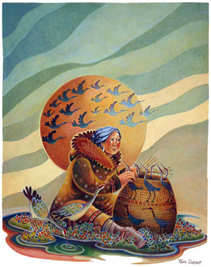 Crane Woman is the result of living on the tundra in Western Alaska, where we listened to the returning of cranes in the spring. Their voices reminded me of the sound of old women talking, and, over the years, a story slowly emerged of an old woman who had gone away from the village during a time of starvation. She takes with her a bundle of tule grass to weave until she falls asleep. As she begins to weave, Crane approaches her and asks for help. Winter is coming early and the young cranes are not strong enough to make their journey south. The next morning the old woman takes her grass to the river and talks to Crane about the coming spring, and as the young cranes listen she slowly weaves them into a basket to keep them safe with her in the hut through the winter. All winter she sings to them and in the spring, when Crane returns with her flock, the basket is unwoven and the young cranes fly free. On Instagram yesterday I stumbled on my painting of Crane Woman. The art was posted by Laura Medha with reference to the work of 'The Thirteen Original Clan Mothers,' and their guidance to help us as we interact with everything that composes our world. The post was a brief period of feeling grounded for me...a feeling hard to come by lately. It renewed my fondness for the painting but also made me realize that many things in our lives come together at different points in our lives. I had just finished reading BRAIDING SWEETGRASS by Robin Wall Kimmerar. It was the book I read myself to sleep with at the end of tense political and covid days. Her book grounded me in the same way. The book grounded me each night, reconnecting me to the larger, more supportive world of nature. Robin's writing renewed my sense of belonging to a world that connects itself in a healthier, more nurturing way than the human world often does. But that world and its stories needs our stewardship. As Crane Woman sits weaving, I ask that she use the wisdom of elders to create a basket of protection for all of nature, to weave the strong but humble tule grass tightly around all of us, to let us see ourselves tied to the circular pattern of nature. 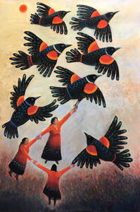 This has been a year of turmoil in our society, of people frustrated with the plight of other people, of coming face to face with our own desire to reach for a higher place of understanding and compassion for others while feeling divided. I often turn to books to try to understand my feelings. Reading myself in another person's story is often like seeing myself better in a mirror, the for better or worse of 'oh, that's who I really am,' and 'this is where i fit in', or 'these are the people I am connected to'.
I have felt a deep connection to this year's books, THE MORNING THE SUN WENT DOWN, by Darryl Wilson, THERE, THERE by Tommy Orange, CANYON DREAMS by Michael Powell, and then felt a much needed affirmation to do what I am excited by...my art and writing... in THE MOMENT OF LIFT by Melinda Gates. Her book is about improving societies by improving women's lives, by looking at old rules and customs we have accepted as social mores, rules that tie people down. The book holds stories of the reasons we resist change and the ability we have to create change, to pull others into a a world of better choices and better health, both physical and mental, into a world where we are not afraid to reach up to the next person who may help us fly with our own ideas and dreams. It is also a trust that we will reach down to pull the next person into a better situation with us. That 'moment of lift' she writes about happens when we have the exhilaration of transcending social or physical limitations ( a lack of wings on my part) and reach out to the act that gives us the feeling of reaching our full potential. For an artist and a writer, it is important to remember that feeling, to mark when we feel it and to do more that allows that full energy to come from us, to not question that sharing our thoughts and stories is the thing we are supposed to be doing with our time. Periodically, books like Melinda's come along and make me wonder if I should be doing more volunteering, more donating, more of something to help those who are not as fortunate. While the answer is of course, yes, after some soul searching about what my purpose may be, I realized that my moment of lift comes when i create art and stories. it is the feeling I get when i hear the red-winged blackbirds calling in the wetlands around us while I am painting. While my body may not fly, their music fills me with energy and takes me to a higher place while I am painting outdoors. It is a feeling I can bring back into the studio to share. I would love to hear your thoughts about Melinda Gates' book and also your experiences with your moments of lift.  I am so thankful that I can express my thoughts with images and words. The past two years have been years of other peoples’ words filling my head as they talk of politics. While I need to stay aware and active in the health of our country these social media blitzes have made it hard to hear my own voice.
I have always needed a place to go where I can hear my real self, that wiser, more innocent voice I hold inside. Sometimes an image, more than words holds the feeling of peacefulness and patience I am waiting for. From this need has come a continuing series of paintings of women who are listening. The piece above was the first and is called LISTENING FOR ADVICE. Creating art allows me to let myself think and to hear my own thoughts instead of the thoughts that bubble up in an effort to accept the voice of a larger, more vocal group. I showed the first three pieces in the listening series a year ago. I felt good when I looked at them, but wondered, as artists do, if others would connect to what I felt inside. They all sold with orders for prints and continue to sell. But the real gift has been meeting the people they speak to, and finding a universal need we share, a need to honor our own thoughts and our own visions and to wait until they are clear to us. The voice may come inside our outside of a church, in the forest or marsh, or in the foliage of the jungle. But these paintings are really a reminder to my own self, a reminder that what I really believe is audible if I will be still and alone long enough to listen. 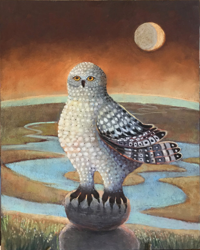 I enjoyed sharing my materials and folk art images and stories with AWS, Artists of Western Sonoma County, last week. The image above has been finished in the studio. I demoed the difference between a 9x12 image done in acrylic and done again, larger (16x20), in pastel. Like painters of all mediums, pastel painters have a wide variety of materials, both in brands and textures as well as quality to choose from. I brought a materials list for hand-outs but ran out and promised I would post the list on my web-site. This list is a list of my favorites and why, not the list that everyone should go by. They are what feel right to me and allow me to create the worlds I enjoy sharing. I try to shop locally but a reliable on-line source is DAKOTA PASTELS
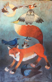
SANDED PAPERS/BOARDS Color Spectrum…for plein air field work. Water and solvent tolerant for textures and layers, but not as accepting of as many layers as some of the higher price papers. Pastel Board…for plein air and studio work. Great for building up textures, painting over old pastel paintings, adding brushstrokes to the texture, and leaving ridges to catch the layers of light. Once the texturing has taken place, Pastelboard needs high quality Terry Ludwig, Blue Earth for layers that are the most satisfying. Wallis Paper… for the way I work, this was my favorite. Difficult to get now. Pastel Premier…closest thing to Wallis I have used. Other Wallis fans that like putting paint under pastel or solvent with their pastel have gone to UART. PASTELS IN MY COLLECTION Hard: Good for, but not limited to,underpainting and for chiseling into trees and bushes, and making distinctive strokes Nupastel Alpha Color (a ‘low quality’ but very effective pastel, often used in schools) Soft: Terry Ludwig: most versative for underpainting and painting over multiple layers. Great for turning on side as well and end and dragging across paper. Often used for my underpaintings Schmincke: soft, buttery, creamy and covers other layers well. Often not rolled perfectly so not as good for using on their sides Unison: one of my favorites, esp for darks, but not as adaptable to multiple layers on Pastelboard as Terry Ludwig or Schminke or Blue Earth Blue Earth: My all time favorite for atmosphere and dragging over mulptiple layers on board. Too expensive for me to use as underpainting. Diane Towsend Terrage: they include their own grit so can go over anything, with one cautionary note…I used them for underpainting and they fall like dust to the floor. The darker colors are spectacular. Great for light spots in the sky and scrubbing away softer layers. 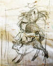 Fox has been wanting to reappear in one of my paintings, this time in celebration of a supportive community, good health, and friends. No better way than dancing with his his own friends, was my initial thought. How quickly I realized Raven had been left out. Raven seems to have a way of thinking every show is his.  So, I made space for Raven at the bottom. All he did was watch while his friends danced. He also felt that a good dance should take place in the moonlight or in a void. So I put the moon in and that is when Ptarmigan had to fly by to balance things out. 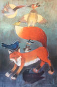 Fox decided he needed to open his eyes a bit and pay attention to Raven. Owl was a little wary of the dance, trying to keep watch over two tricksters. But for the rest sheer fun and for me, I could start creating the world of color they would be in. I love layering pastels into a glowing background. Raven was feeling rather plain and began to complain.
 Or, on a sandbar, I thought. With the Ocean. Raven's voice was loud and clear, "I want some of that red you gave Fox", he demanded. So I let him snatch a piece of red hair from Fox. Fox's eyes glared with highlights. I was getting frustrated. Time to pay attention to the other characters,strengthen their colors, add some highlights. And clean up my act...or the painting. Maybe Raven didn't stand out. He got a big lost without any of the red from Fox. So, Raven was given some red and the void was deepened. Come on Raven, you have driven the artist crazy on this one, but I have to admit you have a nice red glow to your tail, and Owl approves, although he is still doing his balancing act. Now all we need is a better photo. And a word for Raven...I have to admit, your constant chatter made a better painting. 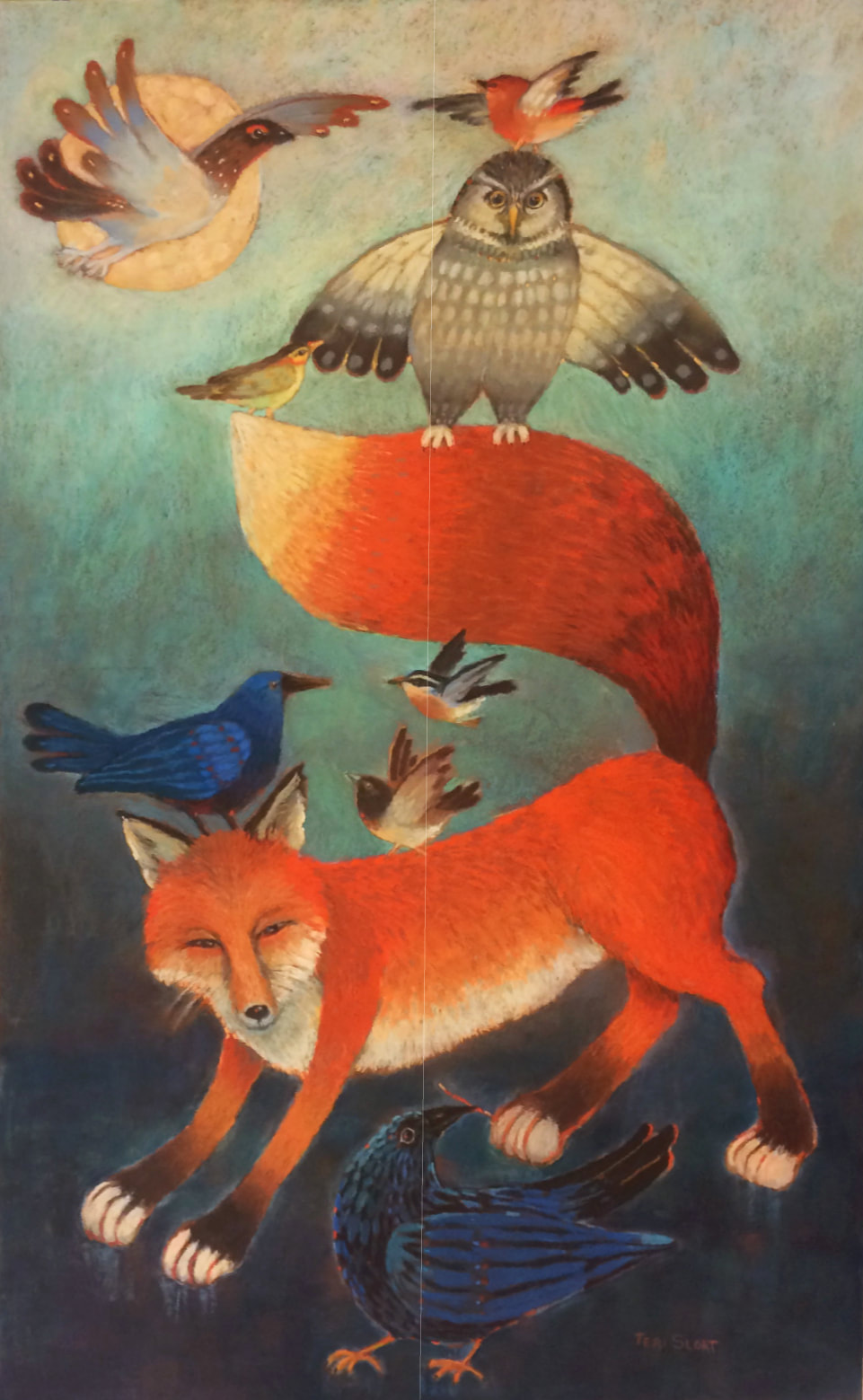 |
Teri SloatIf you would like to read earlier installments of Painting The Sky, you can find them here. Archives
January 2024
Categories |
 RSS Feed